title: " secondary teachers" highlights the subject of the magazine (e.g topics that are going to involve secondary school teachers) this is also highlighting the target audience of the magazine witch is obviously teachers.
sub title: "do boys and girls learn differently"? this subheading shows one of the main issues raised in the magazine, it has been phrased as a question to make the reader start thinking about it before the have even opened up the magazine , drawing the reader in. teachers will be interested in this question as they will want to know if they need to change there own techniques of teaching, this will also draw them in.
date: shows when the magazine was released and is useful for knowing if the story's are relevant for the current time.
image: holds connotations that the teaching is good as the students in the pictures look happy and enthusiastic. it would make the teachers believe that this magazine has something to offer to make the students look and feel in this way. the picture is a front on mid shot also betraying the scene of confidence.
Thursday, 15 October 2009
collage magazine
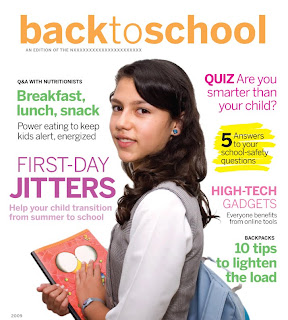
 There are many different types of collage magazines, some been very different to each other. Hear i have found a collage magazine that i feel is very similar to a music or gossip magazine. My reasons for this are that the text is in bold bright colors. this is to attract the audience. also the layout is very similar to one of a music magazine with a mid camera shot of a student with sub heading surrounding her. The sub heading are about the story's in side the magazine with key words like jitters and quiz standing out. The audience to this magazine will not only be the student going back to school or collage but the parents to as there is a quiz about been smarter than your child.
Monday, 12 October 2009

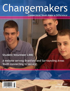
Changemakers is a collage magazine. i think that the magazine is aimed at young students looking to make a change. The title is the main reason for my idea.
On the front page there is very little text, this is so its not overwhelming for the reader they can just pick it up scan the front cover and no exactly what the magazine is offering. The title Chagemakers is quite appealing if you are a student looking for some guidance or change with your studies.
The image of 3 young students is a very large image covering a lot of the cover shows them smiling and getting on with work, this is showing that the read this magazine they made the change and now are happy more confident about what they are doing.
a bar code is at the bottom showing it is for sale, or maybe found in a library. The date and issue is in the bottom Corner showing its a on going magazine.
typeography
Typography refers to the arrangement of text on a page, and appears in some form or another in all instances of written communication. Depending on the purpose, typography can be used for optimum readability, impact, or an artistic statement. Some grphic desinger work totally in text, and study typography extensively while they perfect their art. Quality typography can make a big difference in communications, because it can impact the way the reader sees and feels about the topic being discussed.
At the most basic, typography is a combination of font, size, spacing, and color.For example, wiseGEEK articles use a clear sans serif font in a moderate size, arranged on the screen for maximum readabilityThe text is black on a pale background, further enhancing the readability, and links within the text stand out because they are underlined, and in a different color. The overall purpose behind the typography of the article is to clearly communicate written information to a reader.
At the most basic, typography is a combination of font, size, spacing, and color.For example, wiseGEEK articles use a clear sans serif font in a moderate size, arranged on the screen for maximum readabilityThe text is black on a pale background, further enhancing the readability, and links within the text stand out because they are underlined, and in a different color. The overall purpose behind the typography of the article is to clearly communicate written information to a reader.
Friday, 9 October 2009
magazines


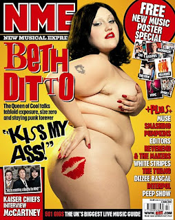
The two magazine covers above are from a collage magazine and a top music magazine.
As you can see there is a distinct difference between the two magazines. the NME magazine uses big bold bright text to appeal to the audience. it also uses slogans that will catch the readers attention such as "kiss my ass" NME has a bright colorfull background with a large image in the center off Beth ditto, a famous artist. The NME advertise free stuff to draw audiences in.
the school collage magazine on the other hand is very plain a black background with a few images down the side, it is very simple. straight off you notice it is obviously for a different audience. the NME is trying to draw people in to read the magazine were as the collage magazine doesn't have to, as people who will pick that magazine up are people who are involved with the collage parents, students and staff. the NME is open to the public and is made for entertainment and enjoyment. As you can tell the NME is trying to sell its self with famous people bold bright writting and inviting slogans, the collage magazine is full of information and people will pick it up if they want to know something about the collage.
Subscribe to:
Posts (Atom)

