the article will be along the bottom in formal text. I noticed alot of double page spreads were lay ed out this way so i based mine in the same arrangement. i also have3 smaller images down the side of the page giving the audience some more understanding on what the article will be about.
Friday, 11 December 2009
mock double page spread
this is my double page spread , the main image covers half of the page and go's across both pages to give it some continuity. the head line will be across the main image in bold text so the audience can clearly see what it is about.
mock content page
this is a mock layout of my content page. it consists of a main image covering about 50% of my page , i made it this size as many top magazines have it this way. the masthead is across the top to keep it linked with the front cover and so people know straight away what they are looking at. my contents page has the features witch is page numbered and what is on each page so the reader knows were to look for each particular story. and in the bottom left Corner i have a space for things that are in every weeks issue of my magazine such as quiz's or competitions.
mock layout front cover
i have used the same layout as many top music magazines use to creat there magazines. with the masthead across the top and a big main image cover a large percentage of the page. To ether side cover lines, and at the bottom, the bar code date and issue. this is the most used layout in music magazines so i feel it will be best for my magazine to.
Thursday, 10 December 2009
planning
i have now done my research. i am going to move onto planning witch consists of mood boards, mock layouts and spider diagrams. planning is a stage were you pull all your research together and start to create my own magazine cover using all the codes and conventions to create a well presented magazine cover contents page and double page spread. i am going to use :
-main image
-text
-fonts
-bar code
-date /issue
-cover lines
-colour
to create my magazine after doing all of my research i will lay it out in the way many top music magazines have done to create a realistic music magazine.
to do this i will use technology such as word, publisher, photo shop and paint. this will give me the opportunity to make it look as professional as possible. i will also plan using spider diagrams to help give me a clearer idea of my magazine. i will produce mock layouts of the front cover contents page and double page spread using publisher. i will then start to construct my final copies on photo shop
planning - target audience
I am going to be creating an R&B music magazine, after my research i feel that the target audience for my magazine is for 16-24 men and woman who enjoy listening to R&B music and like to know the news and gossip of there favorite artists and the R&B industry. i belive this would be the best age group of people as they listen to music more than anyother age catogory. i chose men and woman beacuse there are faoumor woman artists in the R&B genre witch appeals to girls rather than boys.
Monday, 7 December 2009
double page spread
this is another double page spread i found in the same issue of Q magazine. the spread is about another well know band oasis. i picked this one out as i belive its another good exsample of a double page spread , i noticed it had a similar layout as the westlife double page spread. the image this time only covers 50% of the page. it shows the band members walking down a street looking very causual , the text on the other hand says the unliky lads, in bold white writting, this is suggesting they have done something who noone expected them to do. this makes the reader want to know more about the article and again just like in the other double page spread the article is in very small writting.
double page spread
This double page spread is out of Q magazine. i have noticed that all off the double page spread i have researched they are very similar in the way they have been presented. In this particular double page spread the main image is off westlife a highly successful pop band. the image covers about 75 % of the double page spread. the main image links to the text witch says smell the glove in big bold red writing, this is done so it catches the readers attention straight away. the image shows each band member pointing or showing there gloves. underneath the main image there is an article about the band. it is particularly small so people who read it would have to be drawn in by the big image as i don't feel people would be drawn to it straight away. down the right hand side of the spread there is further more images showing the band at a concert and singing autographs this give the impression the text at the bottom maybe talking about up coming events or how the concert went. the audience for this page would be fans of the band west life and who are interested in what they have to say.
content page
The image of the contents page is of a band standing on a hill which is natural which is quite calm and different to the conventional plain background.Also the contents page is in 3 columns. 1 column is named features this will include all the main headline witch is inside the magazine. the word features is in white with a red back ground this could link to the institution of the magazine witch is Q, witch is lay ed out is the same way White with a red background. The second column is named every month. this shows what is included in the magazine every month. it is all so linked with the institution of the magazine with a red background and white writing. the 3d column is called review this shows all the reviews with famous artists.
Friday, 4 December 2009
This is a collage of vibe magazines. In each one of these magazines they all have the same layout. Each vibe magazine has a main image in the center of the page of a successful artist with the masthead slightly behind them.
The institution of all of these magazines is vibe, and the purpose and objectives is to inform entertain and make money. This is done through sell lines, of cover lines and the main image of a well known artist. All music magazines contain these, they are just little snippets of what is in the magazine. what cover lines do is sell the magazine and draws the reader in. all off these magazines have bar codes this shows it is there to make money.
The colour in each of the magazines is bring to catch the readers attention. in many of the the magazines the masthead is in the same colour as the sell lines these are the ones that stand out most.
Friday, 27 November 2009
Vibe is a well known top R&B music magazine. this magazine represents media language through masthead, main image, main cover lines and cover lines. it is clear to the audience that it is a well known magazine becks the masthead is slightly covered by the main image.
This shows that people don't need to see the name of the magazine to know what it is. The word vibe can be associated with music this also represents the fact it is a music magazine. vibe also use vibrant colour's to catch the readers eye. the main image in the particular magazine is akon, but in all of vibes magazines they use well known successful artists.
They do this because the know the audience will want to read about them. In alot of vibes magazines the main image takes up alot of the front cover. In this image akon is pointing towards you, this is done to draw the reader in making them think its them who should read it.
The main cover line is also about akon. this gives information about what is inside the magazine. as you can see the akon and hit are in bold these words jump out at the reader to catch the eye and make them want to read more.
the ideology of this magazine is vibe. the purpose it to give information about the world or R&B music.
Friday, 13 November 2009
representation
representation is the way something or someone is represented, for example phil mitchel is represented to the audience as the local hard man in tv soap opra in eastenders. he is given cirtain roles to play to create this character so he is represented this way.
Tuesday, 10 November 2009
audience
a target audience, or target group is the primary group of people that something, usually is aimed at appealing to. A target audience can be people of a certain age group, gender, teenagers, females, single people, etc. A certain combination, like men from twenty to thirty is often a target audience. Other groups, although not the main focus, may also be interested. Discovering the appropriate target market. to market a product or service to is one of the most important stages involved with market research. Without knowing the target audience, a company's advertising and the selling efforts can become difficult and very expensive. for a music magazine you have to look at different genres of music for exsample rock, pop, metal and so on.
Ideology
This is the idea of what the magazine would be selling. The things that are included in something that makes it important, like the idea that ideology for Q magazine will be rock bands or just rock in general and the ideology of a football magazine is football.
Monday, 9 November 2009
media language
media language is made of visual written and technical elements carefully selected to represent different types of products and their target audiences. for example magazines use different combinations of images titles and content to create genericformulas aimed at diffrent readerships and audiences.
Friday, 6 November 2009
music magazine brief
main task : the front page, contents ans double page spread of a new magazine. all images and text used must be original, produced by you-minimum of four images.
Thursday, 22 October 2009
After alot of planning about what my collage magazine is about i have come to a decision that it will be about sport as you can see in my picture bored below. My collage magazine is aimed at all students, boys and girls who are involved in sport or students who are interested in how the sports teams are doing. the age is between 16-19 year old. Also the coaches will also will be interested in the magazine. inside my magazine the content will involve interviews with the coaches of football and rugby team, in action pictures off the wyke collages teams, questionnaires , upcoming events for example presentation evenings and match fixtures. and trip. although i haven't yet put together my front cover i am staring to look at how that will be laid out at the moment.
Monday, 19 October 2009
A mood board is a type of poster design that may consist of images, text, and samples of objects in a composition of the choice of the mood board. my mood bored consists of sporting activities in collage. the mood board has helped me get my ideas down on paper so i can look at all the different topics involving sport. The images are of many types of sport, different event that are on with in the collage such as sports awards presentation, matches for girls and boys for example football and netball. hopefully this mood board gives me a better idea of what my magazine will focus on.
Sunday, 18 October 2009
fonts
the use of fonts can enhance a piece of text or an image a massive amount. the style of font in any thing from a magazine to on a water bottle generally have a theme or a reaons behind it. for exsample your american , the font theme would be red , white and blue
planning
i have now done my research. i am going to move onto planning witch consists of mood boards, mock layouts and spider diagrams. planning is a stage were you pull all your research together and start to create my own magazine cover using all the codes and conventions to create a well presented magazine cover and contents page.
Thursday, 15 October 2009
: Conventions of a College Magazine Contents Page
More pictures - Help show what more of the stories are about and sparks interest with the reader. The pictures are numbered with their corresponding pages to make it easier for the reader to find out about any particualrly interesting pictures.
Page numbers - Not just a convention of a College Magazine, but of magazines in general. Helps the reader quickly find particular articles which they want to view and saves them from looking through the whole magazine when they only want to view one particular excerpt.
Small information about articles - In the main contents listings there are small, one sentence long summaries of each article. This is to give enough information to further interest the reader, makign them want to keep reading the artice, but not giving away so much information that reading it would be unnecessary. I think this is a very clever way of engaging the readers interest, as normally, when a person knows only a small part of something, they want to know more about it, so they are more liekly to read the article and show interest in the subject, due to their desire to know more"
conventions of a collage magazine
title: " secondary teachers" highlights the subject of the magazine (e.g topics that are going to involve secondary school teachers) this is also highlighting the target audience of the magazine witch is obviously teachers.
sub title: "do boys and girls learn differently"? this subheading shows one of the main issues raised in the magazine, it has been phrased as a question to make the reader start thinking about it before the have even opened up the magazine , drawing the reader in. teachers will be interested in this question as they will want to know if they need to change there own techniques of teaching, this will also draw them in.
date: shows when the magazine was released and is useful for knowing if the story's are relevant for the current time.
image: holds connotations that the teaching is good as the students in the pictures look happy and enthusiastic. it would make the teachers believe that this magazine has something to offer to make the students look and feel in this way. the picture is a front on mid shot also betraying the scene of confidence.
collage magazine
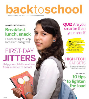
There are many different types of collage magazines, some been very different to each other. Hear i have found a collage magazine that i feel is very similar to a music or gossip magazine. My reasons for this are that the text is in bold bright colors. this is to attract the audience. also the layout is very similar to one of a music magazine with a mid camera shot of a student with sub heading surrounding her. The sub heading are about the story's in side the magazine with key words like jitters and quiz standing out. The audience to this magazine will not only be the student going back to school or collage but the parents to as there is a quiz about been smarter than your child.
Monday, 12 October 2009
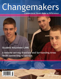
Changemakers is a collage magazine. i think that the magazine is aimed at young students looking to make a change. The title is the main reason for my idea.
On the front page there is very little text, this is so its not overwhelming for the reader they can just pick it up scan the front cover and no exactly what the magazine is offering. The title Chagemakers is quite appealing if you are a student looking for some guidance or change with your studies.
The image of 3 young students is a very large image covering a lot of the cover shows them smiling and getting on with work, this is showing that the read this magazine they made the change and now are happy more confident about what they are doing.
a bar code is at the bottom showing it is for sale, or maybe found in a library. The date and issue is in the bottom Corner showing its a on going magazine.
typeography
Typography refers to the arrangement of text on a page, and appears in some form or another in all instances of written communication. Depending on the purpose, typography can be used for optimum readability, impact, or an artistic statement. Some grphic desinger work totally in text, and study typography extensively while they perfect their art. Quality typography can make a big difference in communications, because it can impact the way the reader sees and feels about the topic being discussed.
At the most basic, typography is a combination of font, size, spacing, and color.For example, wiseGEEK articles use a clear sans serif font in a moderate size, arranged on the screen for maximum readabilityThe text is black on a pale background, further enhancing the readability, and links within the text stand out because they are underlined, and in a different color. The overall purpose behind the typography of the article is to clearly communicate written information to a reader.
Friday, 9 October 2009
magazines
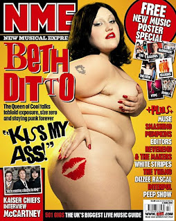
The two magazine covers above are from a collage magazine and a top music magazine.
As you can see there is a distinct difference between the two magazines. the NME magazine uses big bold bright text to appeal to the audience. it also uses slogans that will catch the readers attention such as "kiss my ass" NME has a bright colorfull background with a large image in the center off Beth ditto, a famous artist. The NME advertise free stuff to draw audiences in.
the school collage magazine on the other hand is very plain a black background with a few images down the side, it is very simple. straight off you notice it is obviously for a different audience. the NME is trying to draw people in to read the magazine were as the collage magazine doesn't have to, as people who will pick that magazine up are people who are involved with the collage parents, students and staff. the NME is open to the public and is made for entertainment and enjoyment. As you can tell the NME is trying to sell its self with famous people bold bright writting and inviting slogans, the collage magazine is full of information and people will pick it up if they want to know something about the collage.
Monday, 5 October 2009
Monday, 28 September 2009
the brief
Preliminary exercise using DTP and an image manipulation program, produce the front page of a new school/college magazine, featuring a photograph of a student in medium close up plus some appropriatly laid out text and a masthead. Additionally you must produce a mnock up of the layout of the mockup of the layout of the contents page to demonstrate their grasp of DTP.Main task - the front page, contents and double page spread of a new music magazine. All images and text used must be original, produced by you - minimum of four images.Presentation of your work - The presentation of the research, planning and evaluation may take the form of any one, or combination of two or more, of the following;
A presentation using a slide show
blogA
podcast
A presentation using a slide show
blogA
podcast
Subscribe to:
Posts (Atom)